This is the first post in a series detailing the various components in my WPF open source projects.
The Adorners class fist appeared on this blog back at 2010, it’s a small component that let you attach a template to a control and then open an instance of that template in an adorner.
The code is on github at https://github.com/nirdobovizki/MvvmControls
Usage:
- Create a ControlTemplate.
- Inside the control template use an AdornedPlaceholder element, this element will position itself right on top of the attached control and you can use it for positioning.
- Set the control template using the Adorners.Template attached property
- To show and hide the adorner user the Adroners.IsVisible attached property
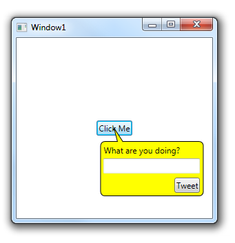
Demo:
<UserControl
              xmlns="http://schemas.microsoft.com/winfx/2006/xaml/presentation"
              xmlns:x="http://schemas.microsoft.com/winfx/2006/xaml"
              xmlns:a="clr-namespace:NirDobovizki.MvvmControls.AdornerLib;assembly=MvvmControls.Wpf">
     <UserControl.Resources>
         <ControlTemplate
 x:Key="PopupTemplate">
             <Grid HorizontalAlignment="Left"
 VerticalAlignment="Top">
                 <a:AdornedPlaceholder/>
                 <Grid Width="150" Height="100" Margin="5 10 0 0">
                     <Rectangle Stroke="Black"
 Fill="Yellow" RadiusX="6" RadiusY="6" Margin="0 20 0 0"/>
                     <Path Stroke="Black" Fill="Yellow" Data="M 25 20 L 20 0 33 20" Margin="0 1 0 0"/>
                     <TextBlock Text="What are you doing?" Margin="5 25 0 0"/>
                     <TextBox Margin="5 45 5 0"
 VerticalAlignment="Top"/>
                     <Button Content="Tweet"
 Margin="5" VerticalAlignment="Bottom"
 HorizontalAlignment="Right"/>
                 </Grid>
             </Grid>
         </ControlTemplate>
     </UserControl.Resources>
     <Grid>
         <ToggleButton
            Content="Click Me"
            HorizontalAlignment="Center"
            VerticalAlignment="Center"
            a:Adorners.Template="{StaticResource PopupTemplate}"
            a:Adorners.IsVisible="{Binding IsChecked, RelativeSource={RelativeSource Self}}"/>
     </Grid>

</UserControl>
Changes from the version that appeared in the blog:
- Added: DataContxet now flows automatically from the adorned element to the adorner popup (previously this required a little bit of code in the popup XAML)
- Fixed: Fixed a bug that caused the VS2015 XAML editor to go into an infinite loop.
- Changed: Usage example changed to be more MVVM-ish and not use code behind