This is Part 4 of a series, you may want to read part 1, part 2 and part 3 first.
In the previous post I promised a cool-looking popup – so we’ll start with the screenshots and follow with the code to create them.
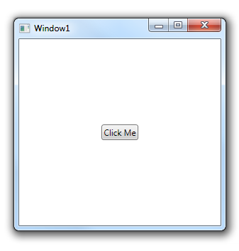
We start with the same window-with-a-button we used in the first post in the series:
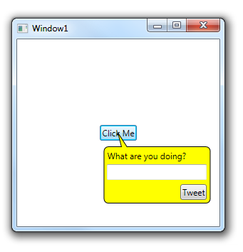
But when we click the button we get a speech bubble popup!
How did we do that?
First, let’s look at the Window.xaml file:
<Window x:Class="AdornerDemo.Window1"
    xmlns="http://schemas.microsoft.com/winfx/2006/xaml/presentation"
    xmlns:x="http://schemas.microsoft.com/winfx/2006/xaml"
    xmlns:a="clr-namespace:AdornerDemo"
    Title="Window1" Height="300" Width="300">
    <Window.Resources>
        <ControlTemplate x:Key="PopupTemplate">
            <Grid HorizontalAlignment="Left" VerticalAlignment="Top">
                <a:AdornedPlaceholder/>
                <Grid Width="150" Height="100" Margin="5 10 0 0">
                    <Rectangle Stroke="Black" Fill="Yellow" RadiusX="6" RadiusY="6" Margin="0 20 0 0"/>
                    <Path Stroke="Black" Fill="Yellow" Data="M 25 20 L 20 0 33 20" Margin="0 1 0 0"/>
                    <TextBlock Text="What are you doing?" Margin="5 25 0 0"/>
                    <TextBox Margin="5 45 5 0" VerticalAlignment="Top"/>
                    <Button Content="Tweet" Margin="5" VerticalAlignment="Bottom" HorizontalAlignment="Right"/>
                </Grid>
            </Grid>
        </ControlTemplate>
    </Window.Resources>
    <Grid>
        <Button Content="Click Me" HorizontalAlignment="Center" VerticalAlignment="Center" a:Adorners.Template="{StaticResource PopupTemplate}" Click="ShowPopup" Name="Btn"/>
    </Grid>
</Window>
We have a control template that describes the popup, similar to the validation we have a placeholder element – this time it’s AdornerDemo.AdornedPlaceholder – that we use to position the popup.
There’s also an AdornerDemo.Adorners class and we use the Adorners.Template attached property to connect the template to the button.
The Button click event shows the popup, let’s look at the event code:
private void ShowPopup(object sender, RoutedEventArgs e)
{
    Adorners.SetIsVisible(Btn, true);
}
To show the adorner we just set the Adorners.IsVisible attached property to true, in this example we did it in code but we can also do so in XAML with a trigger.
Now, let’s look at that Adorners class that does all that magic:
using System;
using System.Windows;
using System.Windows.Controls;
using System.Windows.Documents;
using System.Windows.Threading;

namespace AdornerDemo
{
    public class Adorners
    {
        // Template attached property

        public static readonly DependencyProperty TemplateProperty =
            DependencyProperty.RegisterAttached("Template", typeof(ControlTemplate), typeof(Adorners),
            new PropertyMetadata(TemplateChanged));

        public static ControlTemplate GetTemplate(UIElement target)
        {
            return (ControlTemplate)target.GetValue(TemplateProperty);
        }
        public static void SetTemplate(UIElement target, ControlTemplate value)
        {
            target.SetValue(TemplateProperty, value);
        }
        private static void TemplateChanged(DependencyObject d, DependencyPropertyChangedEventArgs e)
        {
            UpdateAdroner((UIElement)d, GetIsVisible((UIElement)d), (ControlTemplate)e.NewValue);
        }

        // IsVisible attached property

        public static readonly DependencyProperty IsVisibleProperty =
            DependencyProperty.RegisterAttached("IsVisible", typeof(bool), typeof(Adorners),
            new PropertyMetadata(IsVisibleChanged));
        public static bool GetIsVisible(UIElement target)
        {
            return (bool)target.GetValue(IsVisibleProperty);
        }
        public static void SetIsVisible(UIElement target, bool value)
        {
            target.SetValue(IsVisibleProperty, value);
        }
        private static void IsVisibleChanged(DependencyObject d, DependencyPropertyChangedEventArgs e)
        {
            UpdateAdroner((UIElement)d, (bool)e.NewValue, GetTemplate((UIElement)d));
        }

        // InternalAdorner attached property

        public static readonly DependencyProperty InternalAdornerProperty =
            DependencyProperty.RegisterAttached("InternalAdorner", typeof(ControlAdorner), typeof(Adorners));

        public static ControlAdorner GetInteranlAdorner(DependencyObject target)
        {
            return (ControlAdorner)target.GetValue(InternalAdornerProperty);
        }
        public static void SetInternalAdorner(DependencyObject target, ControlAdorner value)
        {
            target.SetValue(InternalAdornerProperty, value);
        }

        // Actually do all the work:

        private static void UpdateAdroner(UIElement adorned)
        {
            UpdateAdroner(adorned, GetIsVisible(adorned), GetTemplate(adorned));
        }

        private static void UpdateAdroner(UIElement adorned, bool isVisible, ControlTemplate controlTemplate)
        {
            var layer = AdornerLayer.GetAdornerLayer(adorned);

            if (layer == null)
            {
                // if we don't have an adorner layer it's probably
                // because it's too early in the window's construction
                // Let's re-run at a slightly later time
                Dispatcher.CurrentDispatcher.BeginInvoke(
                    DispatcherPriority.Loaded,
                    new Action(o => UpdateAdroner(o)), adorned);
                return;
            }

            var existingAdorner = GetInteranlAdorner(adorned);

            if (existingAdorner == null)
            {
                if (controlTemplate != null && isVisible)
                {
                    // show
                    var newAdorner = new ControlAdorner(adorned);
                    newAdorner.Child = new Control() { Template = controlTemplate, Focusable = false, };
                    layer.Add(newAdorner);
                    SetInternalAdorner(adorned, newAdorner);
                }
            }
            else
            {
                if (controlTemplate != null && isVisible)
                {
                    // switch template
                    Control ctrl = existingAdorner.Child;
                    ctrl.Template = controlTemplate;
                }
                else
                {
                    // hide
                    existingAdorner.Child = null;
                    layer.Remove(existingAdorner);
                    SetInternalAdorner(adorned, null);
                }
            }
        }
    }
}
This class doesn’t do much, out of 115 lines 7 are declarations and 50 are attached property boilerplate code, what’s left is the UpdateAdorner method that just create a ControlAdorner (slightly different then the one we used in part 2) add a control to it and set the control template.
Now let’s look at the AdornedPlaceholder class:
using System;
using System.Windows;
using System.Windows.Documents;
using System.Windows.Media;

namespace AdornerDemo
{
    public class AdornedPlaceholder : FrameworkElement
    {
        public Adorner Adorner
        {
            get
            {
                Visual current = this;
                while (current != null && !(current is Adorner))
                {
                    current = (Visual)VisualTreeHelper.GetParent(current);
                }

                return (Adorner)current;
            }
        }

        public FrameworkElement AdornedElement
        {
            get
            {
                return Adorner == null ? null : Adorner.AdornedElement as FrameworkElement;
            }
        }

        protected override Size MeasureOverride(Size availableSize)
        {
            var controlAdorner = Adorner as ControlAdorner;
            if (controlAdorner != null)
            {
                controlAdorner.Placeholder = this;
            }

            FrameworkElement e = AdornedElement;
            return new Size(e.ActualWidth, e.ActualHeight);
        }
    }
}
The only things it does is keep the same size as the adorned element and register itself with the ControlAdorner.
And the new version of the ControlAdorner has one extra method at the end:
using System;
using System.Windows.Documents;
using System.Windows.Controls;
using System.Windows;
using System.Windows.Media;

namespace AdornerDemo
{
    public class ControlAdorner : Adorner
    {
        private Control _child;
        public AdornedPlaceholder Placeholder { get; set; }

        public ControlAdorner(UIElement adornedElement)
            : base(adornedElement)
        {
        }

        protected override int VisualChildrenCount
        {
            get
            {
                return 1;
            }
        }

        protected override Visual GetVisualChild(int index)
        {
            if (index != 0) throw new ArgumentOutOfRangeException();
            return _child;
        }

        public Control Child
        {
            get { return _child; }
            set
            {
                if (_child != null)
                {
                    RemoveVisualChild(_child);
                }
                _child = value;
                if (_child != null)
                {
                    AddVisualChild(_child);
                }
            }
        }

        protected override Size MeasureOverride(Size constraint)
        {
            _child.Measure(constraint);
            return _child.DesiredSize;
        }

        protected override Size ArrangeOverride(Size finalSize)
        {
            _child.Arrange(new Rect(new Point(0, 0), finalSize));
            UpdateLocation();
            return new Size(_child.ActualWidth, _child.ActualHeight);
        }

        private void UpdateLocation()
        {
            if (Placeholder == null) return;
            Transform t = (Transform)TransformToDescendant(Placeholder);
            if (t == Transform.Identity) return;
            var oldTransfor = RenderTransform;
            if (oldTransfor == null || oldTransfor == Transform.Identity)
            {
                RenderTransform = t;
            }
            else
            {
                TransformGroup g = new TransformGroup();
                g.Children.Add(oldTransfor);
                g.Children.Add(t);
                RenderTransform =
                    new MatrixTransform(g.Value);
            }
        }

    }
}
What it does, except for a lot of error checking, is use RenderTranform to move the entire adorner so that the AdornedPlaceholder is directly above the adorned element.
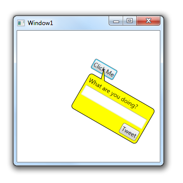
All this messing around with transforms and TransformToDescendant instead of just finding the X,Y offset is important because in WPF you can set any transform you want on any element – so the button could be rotated, for example:
This is all for the adorner series, hope you enjoyed it.
posted @ Monday, July 12, 2010 4:38 PM