This is part 3 of a series, you may want to read part 1 and part 2 first.
Before we continue let’s take a quick look at WPF validation.
Let’s add a property to our window class that will just not validate:
public Window1()
{
    DataContext = this;
    InitializeComponent();
}

public string BadProperty
{
    get { return "Bad"; }
    set { throw new Exception("Value must be \"Bad\""); }
}
And bind to this property:
<TextBox VerticalAlignment="Center" HorizontalAlignment="Center" Width="150" >
    <TextBox.Text>
        <Binding Path="BadProperty" UpdateSourceTrigger="PropertyChanged">
            <Binding.ValidationRules>
                <ExceptionValidationRule />
            </Binding.ValidationRules>
        </Binding>
    </TextBox.Text>
</TextBox>
Now every time we try to type something into this control we get a red border around it:
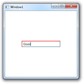
Not very impressive, is it? WPF actually let us customize this to get something a a little better, just drop this into your window:
<Window.Resources>
    <Style TargetType="{x:Type TextBox}">
        <Setter Property="Validation.ErrorTemplate">
            <Setter.Value>
                <ControlTemplate>
                    <DockPanel>
                        <Grid DockPanel.Dock="Right" Width="16" Height="16" VerticalAlignment="Center" Margin="3 0 0 0">
                            <Ellipse Width="16" Height="16" Fill="Red"/>
                            <Ellipse Width="3" Height="8" VerticalAlignment="Top" HorizontalAlignment="Center" Margin="0 2 0 0" Fill="White"/>
                            <Ellipse Width="2" Height="2" VerticalAlignment="Bottom" HorizontalAlignment="Center" Margin="0 0 0 2" Fill="White"/>
                        </Grid>
                        <Border BorderBrush="Red" BorderThickness="2" CornerRadius="2">
                            <AdornedElementPlaceholder/>
                        </Border>
                    </DockPanel>
                </ControlTemplate>
            </Setter.Value>
        </Setter>
        <Style.Triggers>
            <Trigger Property="Validation.HasError" Value="true">
                <Setter Property="ToolTip" Value="{Binding RelativeSource={x:Static RelativeSource.Self}, Path=(Validation.Errors)[0].ErrorContent}"/>
            </Trigger>
        </Style.Triggers>
    </Style>
</Window.Resources>
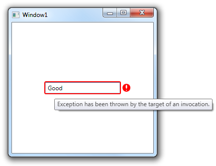
And our validation graphics magically turn into this:
Ok, so what does this has to do with adorners?
When the WPF validation system detects an invalid control it creates and adorner that holds a control (like the one we wrote in the previous post), inserts a control into it and sets that control template to the content of the Validation.ErrorTemplate attached property.
It positions the adorner above the original control so that the AdornedElementPlaceholder is exactly above the control and that let us easily place the control template content relative to the original control.
This is much easier to use than to code the adorner content in C# but the AdornedElementPlaceholder only works in validation, it does not do anything in adorners created by us.
In thenext post we will duplicate the validation system for out own use – and use it to pop up a small cool-looking form inside our application window.
Some notes about validation
- Avoid using exceptions for validations, I used it in the example because it’s less code than the other options but in real code you should either use IDataErrorInfo or write your own VlidationRule.
- There’s a bug in the validation system, the control inside the adorner can receive focus and will interfere with keyboard navigation, add this to your Resources section to fix it:
<Style TargetType="{x:Type Control}">
    <Setter Property="Focusable" Value="False"/>
</Style>
posted @ Monday, July 5, 2010 1:33 PM