New Here?
My name is Nir and I'm the founder of Nbd-Tech, this blog is about things that interest me, so you can find posts on productivity, running a software company and obscure technological topics.
If you like what you read you can
![[RSS]](Skins/NBD/Images/feed-icon-14x14.png) subscribe to the blog feed or
subscribe to the blog feed or
![[Twitter]](Skins/NBD/Images/twitterrific.png) follow me on twitter.
follow me on twitter.
I'm changing the "structure" of my online presence, at the beginning I used this blog for everything, but I'm trying to separate things so it's easier for people to follow the various things I'm involved with.
NirDobovizki.com - what's I'm doing right now and generally the hub of everything I do online.
NirRobotics.com - my new blog about 3D printing, IoT and embedded programing
WPF post and announcements about Nbd-Tech products will continue to be published on this blog.
Thursday, October 22, 2015 #
This is the first post in a series detailing the various components in my WPF open source projects. The Adorners class fist appeared on this blog back at 2010, it’s a small component that let you attach a template to a control and then open an instance of that template in an adorner. The code is on github at https://github.com/nirdobovizki/MvvmControls 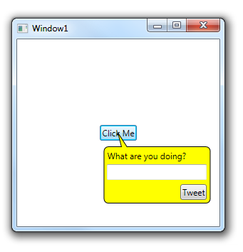
Usage: - Create a ControlTemplate.
- Inside the control template use an AdornedPlaceholder element, this element will position itself right on top of the attached control and you can use it for positioning.
- Set the control template using the Adorners.Template attached property
- To show and hide the adorner user the Adroners.IsVisible attached property
Demo: <UserControl
xmlns="http://schemas.microsoft.com/winfx/2006/xaml/presentation"
xmlns:x="http://schemas.microsoft.com/winfx/2006/xaml"
xmlns:a="clr-namespace:NirDobovizki.MvvmControls.AdornerLib;assembly=MvvmControls.Wpf">
<UserControl.Resources>
<ControlTemplate
x:Key="PopupTemplate">
<Grid HorizontalAlignment="Left"
VerticalAlignment="Top">
<a:AdornedPlaceholder/>
<Grid Width="150" Height="100" Margin="5 10 0 0">
<Rectangle Stroke="Black"
Fill="Yellow" RadiusX="6" RadiusY="6" Margin="0 20 0 0"/>
<Path Stroke="Black" Fill="Yellow" Data="M 25 20 L 20 0 33 20" Margin="0 1 0 0"/>
<TextBlock Text="What are you doing?" Margin="5 25 0 0"/>
<TextBox Margin="5 45 5 0"
VerticalAlignment="Top"/>
<Button Content="Tweet"
Margin="5" VerticalAlignment="Bottom"
HorizontalAlignment="Right"/>
</Grid>
</Grid>
</ControlTemplate>
</UserControl.Resources>
<Grid>
<ToggleButton
Content="Click Me"
HorizontalAlignment="Center"
VerticalAlignment="Center"
a:Adorners.Template="{StaticResource PopupTemplate}"
a:Adorners.IsVisible="{Binding IsChecked, RelativeSource={RelativeSource Self}}"/>
</Grid>
</UserControl>
Changes from the version that appeared in the blog:
- Added: DataContxet now flows automatically from the adorned element to the adorner popup (previously this required a little bit of code in the popup XAML)
- Fixed: Fixed a bug that caused the VS2015 XAML editor to go into an infinite loop.
- Changed: Usage example changed to be more MVVM-ish and not use code behind
Monday, October 12, 2015 #
I’m releasing all my WPF code as open source, this includes 3 projects: MvvmMonkey, MvvmGorilla and MvvmControl. All three libraries are released under the MIT license so you can use them anywhere including commercial projects. MvvmMonkey This is a flexible set of components, each solves a single issue with MVVM (the issue is usually a type of boilerplate code) This is a low-risk library you can use in any project, you can use any part of it with practically no impact on the rest of the code. This library is already on github at https://github.com/nirdobovizki/MvvmMonkey MvvmGorilla This is my “do everything” MVVM framework, it saves a ton of typing and can easily do all the things that should be simple but aren’t trivial in MVVM (like closing a form). This is not a low risk library you can use in just a part of the project, this is a framework you need to work within – but it does do a lot for you. I’m currently cleaning up and documenting the framework in preparation for release. MvvmControls This is a collection of all sort of controls I wrote, this includes all the controls I’ve already released on this blog and some others I wrote for various projects. I’m currently collecting the controls and releasing them, over the next few days more controls will be added to this library almost daily. This library is already on github at https://github.com/nirdobovizki/MvvmControls
Wednesday, May 14, 2014 #
A real conversation I was involved in: Product Manager: the system must have feature XTZ
Developer: this will push the release date by at least two weeks
Product Manager: I'm not discussing the schedule, the schedule is (developer manager) responsibility, the system must have feature XYZ In this particular company the "product team" is responsible for designing the product but the schedule (and cost) is the responsibility of the development division. This causes the product team to dream up a very complicated and detailed product, this also causes them to be unwilling to compromise on anything - because they are completely insolated from the cost of building their design. Can you imagine the same dynamics in a car manufacturer? Car designer: The car should have A, B, C and D
Factory manager: It will cost more to build this car then what we can sell it for
Car designer: I'm not discussing costs, the costs are not my responsibility, the car should have.... Product design isn’t coming up with ideas, product design isn’t building plans to make those ideas come true and product design isn’t making pretty graphics. Product design is taking all the constraints (and if you ever want to be profitable your budget and time-to-market are probably your two biggest constraints), thinking very hard about the tradeoffs and making painful compromises in order to create the most successful product possible under the circumstances.
Those are the code samples from my Webinar, if you are a regular reader of this blog and didn't come here from the webinar you should probably ignore this post.
The table class definition - Treasure.cs download.
using System;
using System.Collections.Generic;
using System.ComponentModel;
using System.Data.Linq;
using System.Data.Linq.Mapping;
using System.Linq;
using System.Text;
using System.Threading.Tasks;

namespace TreasureApp1.Data
{
    [Table]
    public class Treasure : INotifyPropertyChanged, INotifyPropertyChanging
    {
        private int _id;
        private string _type;
        private int _amount;
        private string _unit;

        [Column(IsPrimaryKey = true, IsDbGenerated = true, DbType = "INT NOT NULL Identity", CanBeNull = false, AutoSync = AutoSync.OnInsert)]
        public int Id
        {
            get { return _id; }
            set
            {
                if (_id != value)
                {
                    NotifyPropertyChanging("Id");
                    _id = value;
                    NotifyPropertyChanged("Id");
                }
            }
        }

        [Column]
        public string Type
        {
            get { return _type; }
            set
            {
                if (_type != value)
                {
                    NotifyPropertyChanging("Type");
                    _type = value;
                    NotifyPropertyChanged("Type");
                }
            }
        }

        [Column]
        public int Amount
        {
            get { return _amount; }
            set
            {
                if (_amount != value)
                {
                    NotifyPropertyChanging("Amount");
                    _amount = value;
                    NotifyPropertyChanged("Amount");
                }
            }
        }

        [Column]
        public string Unit
        {
            get { return _unit; }
            set
            {
                if (_unit != value)
                {
                    NotifyPropertyChanging("Unit");
                    _unit = value;
                    NotifyPropertyChanged("Unit");
                }
            }
        }

        [Column(IsVersion = true)]
        private Binary _version;

        #region INotifyPropertyChanged Members

        public event PropertyChangedEventHandler PropertyChanged;

        // Used to notify the page that a data context property changed
        private void NotifyPropertyChanged(string propertyName)
        {
            if (PropertyChanged != null)
            {
                PropertyChanged(this, new PropertyChangedEventArgs(propertyName));
            }
        }

        #endregion

        #region INotifyPropertyChanging Members

        public event PropertyChangingEventHandler PropertyChanging;

        // Used to notify the data context that a data context property is about to change
        private void NotifyPropertyChanging(string propertyName)
        {
            if (PropertyChanging != null)
            {
                PropertyChanging(this, new PropertyChangingEventArgs(propertyName));
            }
        }

        #endregion

    }
}
The data context class TreasureContext.cs download.
using System;
using System.Collections.Generic;
using System.Data.Linq;
using System.Linq;
using System.Text;
using System.Threading.Tasks;

namespace TreasureApp1.Data
{
    public class TreasureContext : DataContext
    {
        public static string ConnectionString = "Data Source=isostore:/Treasure.sdf";

        public TreasureContext(string conectionString)
            : base(conectionString)
        {
        }

        public Table Treasure;
    }
}
The CRUD operations CRUD.cs download.
using System;
using System.Collections.Generic;
using System.Linq;
using System.Text;
using System.Threading.Tasks;

namespace TreasureApp1.Data
{
    class CRUD
    {
        public void Create()
        {
            using (var session = new TreasureContext(TreasureContext.ConnectionString))
            {
                var newObj = new Treasure()
                {
                    Type = "Gold",
                    Unit = "KG",
                    Amount = 50,
                };

                session.Treasure.InsertOnSubmit(newObj);

                session.SubmitChanges();
            }
        }

        public void Read1()
        {
            using (var session = new TreasureContext(TreasureContext.ConnectionString))
            {
                List list = (
                    from o in session.Treasure
                    where o.Type == "Gold"
                    select o
                    ).ToList();
            }
        }

        public void Read2()
        {
            using (var session = new TreasureContext(TreasureContext.ConnectionString))
            {
                List list =
                    session.Treasure.
                    Where( o => o.Type == "Gold" ).
                    ToList();
            }
        }

        public void Update()
        {
            using (var session = new TreasureContext(TreasureContext.ConnectionString))
            {
                Treasure t = session.Treasure.Where(o => o.Type == "Gold").First();

                t.Amount = 500;

                session.SubmitChanges();
            }
        }

        public void Delete()
        {
            using (var session = new TreasureContext(TreasureContext.ConnectionString))
            {
                Treasure t = session.Treasure.Where(o => o.Type == "Gold").First();

                session.Treasure.DeleteOnSubmit(t);

                session.SubmitChanges();
            }

        }
    }
}
The database creation code for the app initialization (partial code) don't forget to add using Microsoft.Phone.Data.Linq; download
            using (var session = new TreasureContext(TreasureContext.ConnectionString))
            {
                if (!session.DatabaseExists())
                {
                    session.CreateDatabase();
                    var updater = session.CreateDatabaseSchemaUpdater();
                    updater.DatabaseSchemaVersion = 1;
                    updater.Execute();
                }
                else
                {
                    var updater = session.CreateDatabaseSchemaUpdater();
                    if (updater.DatabaseSchemaVersion == 0)
                    {
                        updater.DatabaseSchemaVersion = 1;
                        updater.AddColumn("Unit");
                        updater.Execute();
                    }
                }
            }
Sunday, December 22, 2013 #
Disclaimer:I do some work as a subcontractor of the company behind OzCode and I’ll probably become an investor in OzCode, in other words, I'm so impressed with this tool that I'm going to put a significant (for me) chunk of my own hard earned cash behind it.
OzCode is an extension for Visual Studio that adds all sort of debugging aids:
It includes simple stuff like a better exception widow that makes it trivially easy to drill down to the exception base cause.
Unbelievably useful stuff like search in in-memory data structures and the ability to easily see the contents of collections of objects that don’t has a reasonable ToString.
And totally magical features like “simplify” that can break apart complex expressions to show you exactly why that monster expression isn’t returning what you expect it to.
If you develop software for .net do yourself a favor and go download OzCode, debugging will never be the same again.
The last post was about what happened in 2013, now let’s talk about the plans for 2014: yaTimer Time Tracking Software yaTimer is still my flagship product and will continue to be in very active development. Hopefully the great big update – version 3.0 – will finally be released this year. Giraffe Upload Photo Backup Software I will continue to support and fix bugs in Giraffe Upload but I don’t expect any major upgrades in 2014. I really like Giraffe Upload and use it myself but I have to admit that it is unlikely to be a big success, it works, it has customers and I’m happy with it as it is but it is unlikely to pay the bills. The Nbd-Tech web site and blog I’m recovering from my little “burn-out” (you can read all about it in the previous post), I’m starting to get my energy level and creativity back to what their were before and hopefully soon I’ll start writing regularly for this blog again. This web site and blog really look old-fashioned and need some new graphic design, I plan to get this site redesigned soon. Also, this blog runs on SubText, a really nice blogging engine that is, unfortunately, a dead project, none of the core contributors worked on it for a long time and it’s unlikely to be updated in the future, this year I’ll, regretfully, migrate away from SubText into something else, probably the ubiquitous wordpress. The Useful Photo Tips Blog The useful photo tips blog will remain on the “back burner” for a while, I do want to stat posting there again but I have so much to do that realistically it will be a while before I have time to blog about my hobby again. A new project I’m always working on the next big thing and I plan a new product in the project management field, I’m going to announce it soon when its web site is ready. What's your plans for 2014?
Every year I write a post summarizing what I did in the last year and my plans for the next year, I’m not going to break this tradition now. The short story – I worked in the data security field (specifically, on-line fraud prevention), this was super intensive and left me completely burned out, I stopped working in this field and I’m not going to do anything like that again. I’ve been out of the security field for a few month but haven't completely recovered from my “burn-out” yet – but I’m getting better quickly. So, how did my various products did in 2013 and how it comperes to my plans as I published them in January 2013. yaTimer Time Tracking Software yaTimer moved to a subscription only model (as planned) but this turned out to be a mistake and I started selling yaTimer as a one-time payment again a few days ago. The product formally known as “yaTimer Central” was integrated into yaTimer (again, as planned) and is now available together with yaTimer as “yaTimer Desktop + Cloud”. The big yaTimer version 3 that was planned for 2013 didn’t happen, also, I never did start charging for upgrades. Giraffe Upload Photo Backup Software Giraffe Upload got some bug fixes and better diagnostics during the year but there were no major changes. This Blog, The Useful Photo Tips Blog I was too burned out to write – but I am getting better and hope to start blogging regularly again soon. I’ve also recently released two open source projects: Hope I have some readers left after this quite year, please leave a comment and tell me how your year was.
Switching to a subscription-only model was a mistake, people hate subscriptions and prefer the one-time payment model. This isn’t exactly a surprise, but I really needed the stability that reoccurring payments bring with them and I figured that without the one-time option most people will just get the subscription – I was wrong, most people showed their dislike for subscriptions by not buying. So, the yaTimer one-time payment option is back. For $59 you can get a yaTimer license that never expires – but it only includes 6 months of free upgrades (the subscription include all upgrade for the lifetime of the subscription). I still need the stability that subscriptions bring – that is why you can expect my future products to be web-based – where monthly subscription are the accepted norm, I personally truly like local applications but, that’s life.
Monday, December 23, 2013 #
It’s very easy to do simple things with JavaScript (like change this div when that link is clicked) especially with libraries like jQuery to help you, this is why in a lot of companies front end web development is handled by the most junior and unskilled developers in the company. JavaScript is actually a very capable dynamic language that borrows heavily from functional programing, add to this advanced JavaScript frameworks (like Angular) and you got yourself a very advanced and modern environment that uses all that dynamic and functional power. And with today’s “single page web apps” we write big complex programs directly in JavaScript and want (or even have) to use the power of the language and the environment, those are no the previous generation of web apps where everything happened on the server and JavaScript was used to add a little bit of interactivity – this is real software development that happens mainly in JavaScript. And this is where things go wrong, that junior developer strait out of school that only studied basic Java (if you’re lucky) doesn’t know anything about dynamic or functional languages and without some serious mentoring their head will explode when they try to grasp “simple” JavaScript concepts like passing inline anonymous functions around. This is were we are today, frontend web development is often considered simple, unimportant and is generally done by untrained and unqualified junior developers – at the same time that frontend is expected to be both extremely complicated in functionality and look beautiful (and simple). This leaves us with two options – continue to push this work into the hands of the mass of unqualified so-called developers in the hope they’ll mange to teach themselves a pretty substantial amount of advanced concepts and bring in a “highly paid consultant” when this fails (please do continue to do this, sometimes I’m the highly paid consultant) or – treat frontend web development like the advanced difficult field it is and actually pay to bring in the qualified developers to begin with. ok, rant over, what do you think?
|