One of the biggest mistakes I made in the first version of Squirrel Clock is that I structured the GUI around "features" instead of around usage scenarios.
This is an extremely common mistake and it always happens when no one stops to really think about the UI and exactly how people will use it.
So, in the Squirrel Clock 2 I've completely restructured the application around how people will probably use it, for example, I've moved all the common features employees will use to enter attendance and update their details into the same page, this page will also serve as the main menu.
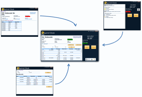
If you look closely at the page at the center of the image you may think the page is a little cluttered, this is actually a good thing - this is because everything is in one place easily accessible so you can finish tracking attendance quickly and spend you time on things that matter.
The page in the image is not the final design, I'm still moving things around in order to make it easier to use so there will be some more changes before the release, if you want to be one of the first to see the real screens register here to be notified when I release Squirrel Clock.
Another mistake I've made is asking for too much information up front, Squirrel Clock is an employee attendance tracking software, it's useless without the list of employees but asking potential customers to enter that list before they even get a chance to play with the software and see it works is asking too much.
So, I've shortened the sign up process from 3 pages to just one - and when you sign up for your trial you will immediately go the your Squirrel Clock home page where you can enter your attendance data - and if you like what you see you will enter all the other employee's details later.
posted @ Tuesday, November 23, 2010 7:00 AM